Judging by the Cover
All four book covers for Never Let Me Go make different implications about the novel. Each cover has a unique color scheme associated with it. Depending on the color scheme, a certain mood can be implied about the novel. The bottom two covers, which contain a darker color pattern, suggest a dark, ominous mood. In contrast, the top two covers, which have a lighter color scheme, imply a more hopeful, or even mysterious, disposition. Thus, the intentions for the cover reflect the individual artist's impression of the novel itself.

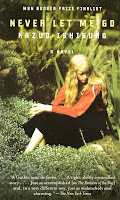
For this analysis, I will examine two book covers. When looking at the first cover (above), the first word that comes to my mind is "life". The artist does a great job of emphasizing the greenery in this cover. By placing the girl, which I assume to be Kathy, in the middle of a sea of grass and plants, the artist forces his/her audience to consider vitality and liveliness. Without having read the novel, this cover paints a rather happy idea of what the book might be about. Typically, an abundance of plants implies a feeling of being alive. The girl in the middle, however, with her head down and frown on her face, suggests that the novel may have a depressing focus. Now that I've read the book, I see how the cover relates to the novel's emphasis on life in such a corrupt system. The children of Hailsham live in a world where they are mislead to believe that their lives are normal with bright futures ahead. In reality, however, the future doesn't have much opportunity in store for them. Thus, the cover underscores this apparent contrast between the way life seems and the way it actually is. Although the girl is sitting in a field full of life and plants (which generally implies an upbeat and optimistic connotation), she acknowledges the reality of her predetermined fate.

The second book cover (above), is much more ominous, and even threatening, than the first one. The title of the novel are written with barbed wire, implying a dangerous nature to be associated with the book. In all honesty, the first words that come to my mind when I look at this cover are "death" and "confinement". I say "death" because of the way that the title is written. The letters are spaced out oddly with no attention to organization or a line scheme. This lack of structure makes me feel that the novel will break the conventions of its genre and create a chaotic setting. I also say "confinement" because the barbed wire makes me think that people are being held against their own will, by force. If I hadn't read the novel, I would think that it was inspired by events in Nazi Germany during the Holocaust. The shape of the barbed wire forms the outline of the internal organs of a human body. This observation makes me think that people may be killed or sacrificed in the novel, with special attention to their human anatomy. Having read the novel, I see the correlation between the cover and the plot. The cover is clearly pointing at the fact that the children of Hailsham will one day be forced to donate their organs. Moreover, the forest in the background of the cover is indicative of the same forest that haunts the children of Hailsham.
Both the first and second book covers are strong in their ability to make implications about the text. Although they both reflect real events and ideas that transpire in the novel, they do so in different ways. To some extent, the covers serve as a "lens" with which to look at the book. This "lens," however, is different for each artist. While the first cover's artist chooses to underscore the irony contained within the novel, the second cover's artist emphasizes a pessimistic outlook. Because of this, it is clear that a book cover can be used to create many different perceptions of a novel. To relate back to the old saying, "don't judge a book by its cover," I now understand the legitimacy of this cliche. While each cover suggests something different about the novel, at the end of the day they all contain the same story.


Good ol' Pete... for the first time in forever you may be on to something my dude. I liked your contrast about life and death between the two covers. It was very insightful into your mind. I see how those pieces and your analysis fits into the story, as Ishiguro wanted the novel to have multiple interpretations. Good job BZ.
ReplyDeleteAye this was a dope blog post Zac(k). I definitely enjoyed your in-depth analysis of each of the two covers since you were able to relate the pictures to messages and themes within the novel. I see how the first cover could relate to how the children of Hailsham were led to believe they had a great life ahead of them as shown through the greenery and nature of the cover picture, but Kathy ends up realizing that this is not the case, showing why she is sad or let down within the cover. I also liked the idea of confinement you explained within the fourth cover, explaining how people could be held against their will. I also could see how the connection to the forest that haunted the children of Hailsham could add to the ominous mood of the picture since it provided mystery and eeriness that hinted at death or another evil.
ReplyDeleteI loved your comparison between the two covers. I believe that you have covered both themes and moods respectively and the contrast between the two was represented throughout. Your comments on the implications of each were spot-on and lead me to think more critically about the text. Well done ballzac.
ReplyDeleteI enjoyed reading your blog post. Right off the back you roped me in with a powerful opening. I don't know if I agree with you that the first cover is supposed to be emphasizing life. I agree with your second analysis though that the cover is emphasizing death and confinement. I believe, like you, that it is reminiscent of the Holocaust.
ReplyDeleteYour opening paragraph is great Zac and I really like how you began to explain what your post was about immediately. Analysis was thorough throughout and you did a nice job discerning the important ideas from the images.
ReplyDeleteGreat thoughts here- Review this to make sure you're hitting on those key big picture ideas: https://image.slidesharecdn.com/paper1sl-150909144325-lva1-app6891/95/paper-1-sl-4-638.jpg?cb=1441810419
ReplyDelete